Data Meta-Metrics
Sometimes I work with great data: I know how and when it's collected, it lives in a familiar database, and represents exactly what I expect it represent. Other times, I've had to work with less-than-stellar data -- the kind of data that comes with an "oral history" and lots of caveats and exceptions when it comes to using it in practice.
When stakeholders ask data questions, they don't know which type of data -- great, or less-than-stellar -- is available to answer them. When the data available falls into the latter camp, there is an additional responsibility on the analyst to use the data appropriately, and to communicate honestly. I can be very confident about the methodologies I'm using to analyze data, but if there are issues with the underlying dataset, I might not be so confident in the results of an analysis, or my ability to repeat the analysis. Ideally, we should be passing this information -- our confidences and our doubts -- on to stakeholders alongside any results or reports we share.
So, how do we communicate confidences and doubts about data to a non-technical audience (in a way that is efficient and easily interpretable)? Lately I've been experimenting with embedding a "state of the data" in presentations through red, yellow, and green data meta-metrics.
**
Recently my team wanted to know whether a new product feature was increasing sales. We thought of multiple ways to explore whether the new feature was having impact, including whether emails mentioning the new feature had higher engagement, and using trade show data to see whether there was more interest in the product after the feature was released. Before starting the analysis, we decided that we'd like this analysis to be repeatable -- that is, we'd like to be able to refresh the results as needed to see the long-term impact of the feature on product sales.
Sounds easy, right? Collect data, write some code, and build a reproducible analysis. I thought so too, until I started talking to various stakeholders in 5+ different teams about the data they had available.
I found the data we wanted in a variety of states -- anywhere from "lives in a familiar database and easy to explore" to "Anna* needs to download a report with very specific filters from a proprietary system and give you the data" to "Call Matt* and see if he remembers". Eventually I was able to get some good (and not-so-good) data together and build out the necessary analyses.
While compiling all of the data and accompanying analyses together for a presentation, I realized that I needed some way to communicate what I had found along the way: not all of the data was equally relevant to the questions we were asking of it, not all of the data was trustworthy, and not all of the analysis was neatly reproducible.
The data meta-metrics rating system below is what I've used to convey the quality of the data and its collection process to technical and non-technical members of my team. It's based on three components: relevance, trustworthiness, and repeatability. The slide below outlines the criteria I used for each score (green, yellow, red) in each category.

Within the presentation, I added these scores to the bottom of every slide. In the below example, the data we had definitely answered the question we were asking of it (it was relevant), and I trusted the source and data collection mechanism, but the analysis wasn't fully reproducible -- in this case, I needed to manually run a report and export a text file before being able to use it as an input in an automated analysis. Overall, this data is pretty good and I think the rating system reflects that. The improvement that would take this data to green-green-green would be pretty simple -- just writing the email data to a more easily accessible database, which becomes a roadmap item if we feel this report is valuable enough that we'll want to repeat it.

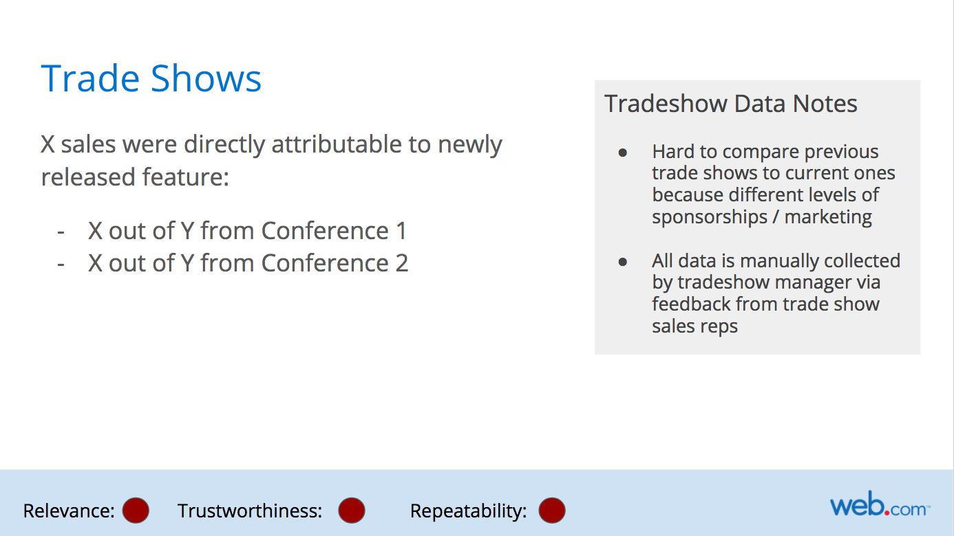
Below is an example of a not-so-great data process. Trade shows are inherently pretty chaotic, and our data reflects that. It's hard to tell what specifically makes a trade show attendee interested in a product, and tracking that journey in real-time is much harder without records of interactions like demos, phone calls, etc.. This becomes another road map item; if we want to dig deeper into trade show data and use it to guide product decisions, we need to implement better ways of collecting and storing that data.
Overall, this exercise was helpful for diagnosing the strengths and weaknesses of our data storage and collection across multiple teams. Providing this data in an easy-to-understand format allowed us to have informative conversations about the state of our data and what we could do to improve it. Getting the rest of the team involved in the data improvement process also helps my understanding of what data we do and don't have, what we can and can't collect, and makes my analyses more relevant to their needs.
The meta-metrics I used here are the ones we specifically cared about for this type of analysis; I could certainly see use cases where we might swap out or add another data meta-metric. If you've worked on conveying "the state of the data" or data meta-metrics to your team, I'd love to hear more about your process and the meta-metrics you've used in the comments.
* Names have been changed to protect the innocent.