On Stanford's COVID-19 Vaccination Algorithm
This past week, Stanford hospital administrators used an algorithm to decide who should be in the first group to receive a COVID-19 vaccine. It didn't go well.
The algorithm's output clearly didn't prioritize frontline workers, including the ~1,300 hospital residents who work closely with COVID-19 patients. Only about 7 of the 5,000 available first-round doses were slotted for residents, which is upsetting to say the least.
Administrators apologized on Friday and declared that they would revise their vaccination plan, but not before swiftly and squarely placing blame— on the algorithm.
On blaming the algorithm
Was this the algorithms's fault? Of course not.
Algorithms are designed, created, implemented, and tested by people. If algorithms aren't performing appropriately, responsibility lies with the people who made them.
As Cathy O'Neil writes, “These models are constructed not just from data but from the choices we make about which data to pay attention to—and which to leave out. Those choices are not just about logistics, profits, and efficiency. They are fundamentally moral. If we back away from them and treat mathematical models as a neutral and inevitable force, like the weather or the tides, we abdicate our responsibility." Blaming "the algorithm" is an unacceptable abdication of responsibility.
In the case of Stanford, the intent behind using an algorithm—"to develop an ethical and equitable process for the distribution of the vaccine"— made sense. Unfortunately, there were serious flaws with the project, and administrators must own responsibility.
Building successful algorithms takes a village
To design, build, and deploy a successful algorithm for a problem like vaccine prioritization, the steps a team would take might look something like this:

The process above is focused on the more technical aspects of algorithm design and implementation, and doesn't include hand-offs, necessary training or coaching, communication, or any of the other pieces necessary for turning an algorithm idea into a successful reality.
At every step, it's important to work with subject matter experts to gain the crucial context and buy-in needed for designing, creating, testing, and deploying a successful model. It's also important to test and reflect at each stage to make sure that expectations (continue to) align with reality. And it probably goes without saying, but the more transparency throughout the whole process, the better for building trust in the results and avoiding missteps along the way.
The algorithm is just one part of the larger vaccine prioritization project which also includes planning, design, communication, implementation, human checks, and testing and feedback along the way. Failure at any stage can mean failure of the entire project. It's easy to level blame at "the algorithm", but here it's a convenient synecdoche for the project of vaccine prioritization as a whole, which was carried out by people; to blame the algorithm is not to acknowledge all of the other mistakes that had to have taken place to arrive at this outcome.
Ironically, while the project was obviously a failure, I'm not sure that we even have enough information to know whether the actual algorithm here is faulty— that providing the "correct" inputs would have provided the "correct" outputs— because the design and implementation were so far off the mark.
What went wrong with Stanford's algorithm?
The largest and most damning error of the Stanford algorithm project comes from the final stage, the human check. Human-in-the-loop is becoming a more common component of algorithm implementation to verify algorithm outputs and provide an opportunity to halt automation if things don't look right. Stanford did have this human check in place, and still rolled out the algorithm's output, which (rightfully) has raised serious questions about the priorities of the administration.
While leadership is pointing to an error in the algorithm meant to ensure equity and justice, our understanding is this error was identified on Tuesday and a decision was made not to review the vaccine allocation scheme before its release today. We believe that to achieve the aim of justice, there is a human responsibility of oversight over such algorithms to ensure that the results are equitable. Negligence to act on the error once it was found is astounding.
- Letter from Stanford's Chief Resident Council to administration
While the human check should have been an opportunity to correct any errors, the final lack of action was not the only mistake in Stanford's process. Here are some other issues that I see with the process of designing, creating, testing, and deploying the Stanford algorithm:
The population inputted into the algorithm seems to have excluded nurses, therapists, janitors, food service workers, and other essential frontline staff. This is a huge error in design -- if these populations weren't considered up front, the algorithm was never designed to be applied to them.
It doesn't appear that a clear (or correct?) definition of success or test cases were implemented, given the number of frontline staff who didn't make the top 5,000 vaccine slots, and other seemingly strange prioritizations.
Not all data elements seem to exist equally for all people the algorithm was meant to be applied to. For example, residents don't have one set "location" (one of the seemingly-important inputs), which seems to have hugely impacted their scores.
The lack of available data elements seems to point to a lack of testing and communication at several stages. Assuming that *some value* was inputted for residents in the design (big assumption here), it clearly didn't translate, which points to a lack of testing when implemented.
The algorithm didn't deliver on previous pledges, pointing to large communication gaps (which manifest as design and testing issues).
How do we prevent this from happening?
In my field (data science), there is increased conversation about creating ethical AI, but (from what I can tell without access to the underlying algorithm) the Stanford algorithm isn't AI— or deep learning or even predictive. And yet it's still a glaring example of how algorithms can be used to perpetrate unethical outcomes. Layering predictions in just exacerbates and adds to the room for failure in the modeling process I outlined above.
So, what can we do?
Stanford's Chief Resident board asked for three things in their letter, which all really boil down to one thing: transparency. Transparency and communication throughout the whole project could have helped to catch mistakes sooner, and reverse them.
Testing also seems to be a huge hole here. Testing that the assumed data was actually available, testing that prioritizations made sense across spectrums like age and COVID-19 exposure, testing that outcomes matched the promises of administrators. Testing at all phases should have caught these errors.
Finally, we need to take the human responsibility in algorithms seriously. This includes the very human decisions that go into designing, planning, and executing projects centered on algorithms. For human-in-the-loop checks, this means providing training on what to look for, and what to do if things look wrong -- ideally with a way to "stop the line" and reverse course if needed.
Algorithms are already being used to determine COVID-19 vaccination prioritization at other hospitals (and more globally) and patient outcomes. It's important that the people who create them take the time and put in the work to get them right.

An Intake Form for Data Requests
Our intake form is opinionated. Years of designing and carrying out analyses has taught me that the more context I have up-front, the better my analysis will be. So, our intake form is designed to gather as much context as we can reasonably get in a few questions.
A couple of weeks ago, I posted a question from our data team's intake form on Twitter:
... which kicked off a conversation around intake forms more generally. I got many requests to share more about our data team's intake form and I'm happy to do that in this post. If you want to skip ahead, you can check out a sample form here.
In the beginning, there was no form
Our data team formed in January and consists of three people -- a data scientist (me) , a data engineer, and an analyst. We soon started getting data requests from all over the company, which would come to us, individually, via Slack channels, emails, meetings, and good ol' fashioned desk drop-bys (remember those?).
Some of these requests were truly painless; they came to us fully-formed and were easy to knock out. Others needed follow-up, with clarifications coming at the (varying) speed of circle-back DMs, and required legwork just to nail down the ask or define the scope. To say that we were doing lots of context-switching would be an understatement. We realized that a more uniform, automated way of gathering requests would help us to better track and triage them, and decided to create a centralized intake form.
We modeled our new intake process after our design team's, who had done a great job of creating and introducing request forms to our company. Following their lead, we posted links to the intake form in our Confluence space and our "public" Slack channel, and made filling form submission the first step to getting a request on our radar. Once submitted, the forms come to my inbox (as the team's lead and manager), and I figure out next steps (further conversations, kickoff meetings, tickets, prioritization, etc.).
Questions we ask and why
Our intake form is opinionated. Years of designing and carrying out analyses has taught me that the more context I have up-front, the better my analysis will be. So, our intake form is designed to gather as much context as we can reasonably get in a few questions.
You can check out a sample intake form here, but I want to call out a two of my favorite pre-analysis questions and why I recommend asking them:
What decision will you make or action will you take with this data?
When I'm framing an analysis, it's helpful to know how the deliverables I provide will be used before I start working on them. The planned decision or action heavily informs the design of an analysis or test from start to finish.
This question also underscores that work requested from our team should result in action. (Nobody wants to spend time creating something that goes unused, or pull numbers for numbers' sake.)What is the real problem you're trying to solve?
There is often a gap between the request as stated on a form and the larger problem it's trying to solve. As the data subject matter expert, understanding the why behind a request gives me an opportunity to add value by working with the requester to fill any gaps. Most often this means recalibrating the analysis based on a combination of the data available (and its quality), the 'real' question we're trying to answer, and any work on similar problems that is in-progress or already complete.
A good rule of thumb is that if you find yourself asking the same analysis-framing question 3 times, it's a good candidate for your intake form.
A little friction goes a long way
One thing we were mindful of while creating an intake form is that we were adding friction to the data request process. Doing so purposefully and in small doses has made our intake process much smoother, and has reduced the amount of work needed to collect pertinent information for data requests. An ideal balance is just enough friction to filter out lazy asks, but not so much that you discourage folks from bringing their requests to you.
We've structured the form in a way that tries not to add too much overhead to simple requests. If you walk through it, you'll notice the form has some basic control flow logic based on request type; so for example, we make it very easy to report a bug by asking only two questions ("what needs to be fixed?" and "is this a blocker?").
Our intake form isn't a substitute for conversation; it's the foundation for it. Adding this step before a kickoff conversation provides us with extremely useful information and gives us context and time to digest and prepare, making our conversations more informed and more productive. Put another way: the answers provided on the form aren't taken as gospel; they help to understand the ask, and give us a better foundation for further conversation.
Further iteration
I've loved reading through the conversation started by my tweet, and it's already given me lots of ideas for iterating on our form. In that spirit, I wanted to share a couple of intake questions I found interesting:
Who will see this deliverable?
Knowing your audience is key for creating an appropriate deliverable! A data person may be okay with a metric labeled median_days_conversion, but that metric would probably need more context to land in a board room.
Above said, I can't tell you the number of times I've created a deliverable for one team and received questions or feedback from another. Unless the thing lives on my computer, I assume it will be shared, but asking with who specifically is intriguing.Will this deliver business value within 90 days?
This straight 🔥 is brought to you by GitLab's visualization / dashboard request template, and reminds me of a question we used at a previous company, basically "Which OKR will this move?" (with a link to the company-wide OKRs).
Asking these kinds of questions outright both reduces lazy asks and ensures that your work will deliver meaningful value to your organization; both are wins in my book.
If you're considering creating your own form, I can't recommend templating, in general, enough. Before this form, I worked on a couple of similar ideas (a ticket template and hypothesis / analysis outline docs), and many of the questions on our form came from these past experiences -- all of which improved data team workflow. I hope our intake form template is helpful as a jumping off point for anyone who wants to create something similar in their company.
If you've created something similar for your company, or have questions about our form, I'd love to chat more on Twitter or in the comments here. If you'd like to get new posts delivered to your inbox, please subscribe via the link below. Thanks for reading!

Git Your SQL Together (with a Query Library)
Focusing on these points has led to my continuous adoption of a query library -- a git repository for saving and sharing commonly (and uncommonly) used queries, all while tracking any changes made to these queries over time.

If I could teach SQL to analysts who plan to work in industry data science, I'd start by sharing a few SQL Truths I've learned, and why I recommend tracking SQL queries in git. Here goes:
You will *always* need that query again
Queries are living artifacts that change over time
If it’s useful to you, it’s useful to others (and vice versa)
Focusing on these points has led to my continuous adoption of a query library -- a git repository for saving and sharing commonly (and uncommonly) used queries, all while tracking any changes made to these queries over time.
Anyone who is following my personal journey might know that I'm in the midst of building data science infrastructure at a start-up. In addition to setting up a data dictionary, setting up a query library is one of the first things I did to start documenting the institutional knowledge we have about our data.
Let’s talk more about these SQL Truths and why they've led me to git my SQL together with query libraries (and how to build one yourself!).
SQL Truth #1: You will always need that query again.
Have you ever written a query for a “one-off” analysis, deleted it (maybe even on purpose! *shudders*), and lost all memory of how to create said query -- just before being asked to re-run or tweak that analysis? Happens to the best of us.
Usually, this is a job for reproducibility. But, even if we take reproducibility seriously (and we do!), it’s easy for queries from “one-off” analyses to slip through the cracks because they can live outside of our normal project workflow. After all, if you’re only doing something once, there’s no need for it to be reproducible, right?
The sooner we can accept that it’s never just once, the sooner we can hit CTRL+S, put them in a query library, and move on to more interesting problems.
SQL Truth #2: Queries are living artifacts that change over time
Here’s a short list of reasons why your queries might change over time:
You’ve become more familiar with database(s)
You’ve gained a deeper understanding of your data
You’ve had to add filters and caveats over time
You’ve changed the way you calculate a metric
You’re answering slightly different questions
You’ve started collecting new data
You’ve found discrepancies or issues with tables or fields
Your business model has changed
You’ve gotten better at writing SQL
This list isn’t all-inclusive, but hopefully it gives you an idea of how and why your queries might change. This isn’t inherently good or bad; it just means that you’ll want to capture the way that you’re doing things both as documentation for the future and to ensure that changes or updates are applied as needed to keep things up-to-date.
SQL Truth #3: If it’s useful to you, it’s useful to others
Have you ever asked a coworker where some data lives and had them respond with a beautiful, hand-curated SQL query? It’s the best. You get to focus more on the fun analysis, or starting new projects, and as a bonus, your company isn’t paying two people to repeat the same process.
SQL queries contain built up domain knowledge -- the way you filter, join, and aggregate tables reflects knowledge you’ve collected about how the data is collected, stored, and should be used for practical application. Sharing queries with others is a nice thing to do, and a good way to spread institutional knowledge about your data (as is building a good data dictionary!).
When you start to compile and compare SQL queries, you might find discrepancies in the way that different people pull the same data. (This happened on a team I was on -- if you asked three of us to pull all live clients, we’d all do it with slightly different caveats that reflected our individual understanding of the data. Not a bad thing, but no wonder our numbers didn’t always match!) Creating and reviewing a query library is also good way to get everyone on the same page.
Building your own query library
Let's focus on how you can build your own query library in a few simple steps:
After writing a query that you’ll want to use again*, save it(!!) as a .sql file with a descriptive name. I tend to name my files based on what the query is accomplishing as output, and since naming things is cheap (and I never have to hand-type the names of these files), I use very descriptive (long) names, like activity_on_mobile_since_june2018_by_client.sql.
*This was a test -- every query is a query you might want to use again!Create a git repository in a shared location and upload your queries to it. Encourage your team to do the same, and discuss how to best organize queries with them. This is also a good time for a mini blameless post-mortem of existing queries (especially if they come from different analysts) by looking for discrepancies and using them as an opportunity to level-up everyone's understanding of the data.
Whenever you create a new query, take a few minutes to clean it up so that others can understand how and when they might want to use it, and upload it to the query repository. Whenever you update an existing query locally, make sure to commit those changes to your query library (ideally along with an explanation of why you made them).
Final Notes
The idea of the query library was introduced to me by Tim, who implemented one for our product analytics team while we were both at Web.com. (You might remember Tim from this post on the career "tour of duty" concept.) It was helpful for our team there, and I've happily implemented one on every team since.
I hope this post is helpful, and I'd love to hear from you if you have a data infrastructure tool or idea to share (or a question!); please write a comment below or ping me on Twitter. Thanks for reading!

Field Notes: Building Data Dictionaries

The scariest ghost stories I know take place when the history of data -- how it’s collected, how it’s used, and what it’s meant to represent -- becomes an oral history, passed down as campfire stories from one generation of analysts to another like a spooky game of telephone.
These stories include eerie phrases like “I’m not sure where that comes from”, “I think that broke a few years ago and I’m not sure if it was fixed”, and the ever-ominous “the guy who did that left”. When hearing these stories, one can imagine that a written history of the data has never existed -- or if it has, it’s overgrown with ivy and tech-debt in an isolated statuary, never to be used again.
The best defense I’ve found against relying on an oral history is creating a written one.
Enter the data dictionary.
A data dictionary is a “centralized repository of information about data such as meaning, relationships to other data, origin, usage, and format", and provides us with a framework to store and share all of the institutional knowledge we have about our data.
As part of my role as a lead data scientist at a start-up, building a data dictionary was one of the first tasks I took on (started during my first week on the job). Learning about our data is a crucial part of onboarding for data-focused roles, and documenting that journey in the form of a data dictionary provides a useful data asset for the company (which helps to preserve institutional knowledge) and simultaneously provides a good resource for analyzing the data. My data dictionary is a Google Sheets workbook that looks something like this:

I use one sheet for each database, and the same fields throughout:
Table: the table name, exactly the way it appears in the database
Table Notes: general notes on the table, like the theme of the data in the table, how often it gets updated, and where it comes from
Field: the field name, exactly as it appears in the database
Definition: a user-friendly (often long-form) definition of the field
Example value: used to show what data in that field actually looks like
Field notes: general notes on the field, sometimes including values, caveats or notes of interest, and places (like tables) to find more information about that field
Yours doesn’t have to look like this, and I’ve seen data dictionaries with other fields and structures, but feel free to borrow mine if you’re looking for a format to start with and riff on -- it’s worked well for me so far.
Lessons Learned and Best Practices
I’ve built at least half a dozen data dictionaries for various companies, and through that experience, some personal best practices have shaken out:
1. Start small and iterate
A couple of times while building a data dictionary, I tried to document every piece of data I found while spelunking around my company’s database, which was very painful and not a great use of time. Don’t do this.
Focus on starting with the data that’s important and useful to you and documenting those fields or tables. Then, as you incorporate more data from other tables or databases, focus on documenting those incrementally. Avoid shaving the yak.
2. Answer your own frequently asked questions
Over time, I’ve found myself asking the same questions over and over again about data lineage and usage, so those are the questions I try to answer when building and filling in a data dictionary. Here’s a basic list of questions to consider:

3. Consider who will be using your data dictionary and how
The structure, content, and location of your data dictionary should be very different if your context is for analyst use in the trenches vs. for business stakeholder understanding. It could also look different depending on the people or groups who will be using it as a reference.
For example, my data dictionaries tend to contain notes pertaining to analyzing the data that others might not need -- things I might edit or remove if I were creating a shared cross-functional resource. I've also created versions of data dictionaries that are structured as documents rather than spreadsheets, a format that lends itself well to going very in-depth about fields (if you can't fit that info in a spreadsheet cell) or sharing with less-technical folks alongside a deliverable (like an analysis). These also make a great first draft to be turned into a more shareable version later.
4. Plan for a living document
For a data dictionary to be useful, it has to be kept up-to-date. This is a challenge that straddles both technical and cultural realms.
Technically, to keep a data dictionary up-to-date, it should to be straightforward for collaborators to access and update. It's also helpful to be able to see when these updates are made to track important changes. Culturally, the importance of a data dictionary should be acknowledged, and upkeep should be incentivized. It's easy to skip documentation if it's not required or seen as important, and this is how documentation grows stale (and eventually dies when deemed worthless).
I'll freely admit that I have yet to implement a data dictionary that perfectly addresses both of these challenges, but I'm working on it, and others have made good suggestions on the "how" below that I plan to incorporate in my own work.
Improvements + More Discussion
There are a few things about my own data dictionaries that could be improved. Namely, I plan to make my data dictionary more “internally public” (as something like a Github wiki or a Confluence page), and add it to source / version control (git) to track changes.
Some of my biggest concerns are making sure that others know about, have access to, and can use and update any data dictionaries I’m building. Some of this is cultural and some of this is technical, so I’m doing by best to tackle these concerns as I’m building, and asking others for advice along the way.
For more ideas and best practices around data dictionaries, check out these two Twitter threads which are full of great suggestions. If you’ve built a data dictionary and have some best practices to share, or if you have questions about how to get started, please feel free to chime in on Twitter or as a comment here.

A Month in the Life of a Data Scientist
I used the 1 Second Everyday app to take a series of one second videos of what my work as a data scientist at an IoT startup looked like during the month of August.
"What does a data scientist actually *do*?"
"What kinds of projects do you usually work on?"
"What does a typical day look like?"
These are questions I get asked a lot both by aspiring data scientists and the folks who want to hire them. My answer, in true data scientist fashion, is usually something along the lines of "it depends" -- and it's true! Most of my work involves juggling multiple projects that might have different stakeholders or touch different parts of the company, and the lifecycles of these projects can vary greatly depending on the complexity involved. In the eight years I've been doing applied analytics, no two weeks have looked the same. Furthermore, data science is such a growing and varied field that it's rare two data scientists would give the same answer (even at the same company!).
To help others get a feel for the types of projects a data scientist might do, and a bit of the day-to-day work, I used the 1 Second Everyday app to take a series of one second videos of what my work as a data scientist at an IoT startup looked like during the month of August. Check it out:
For context, my startup installed hardware into retail stores in order to track cardboard displays (the ones you see in CVS, for example, that are stocked with sunscreen or allergy medication) that go in and out of each store. We used sales data from those stores to calculate the incremental sales gained as a result of having these displays up, in addition to tracking other things like the supply chain process, and reported all of this back to the stores and brands whose products were on the displays. Lots of fun data to play with!
August consisted of three main projects for me (with lots of smaller projects thrown in):
Testing of IoT device updates: as an IoT company, we periodically rolled out firmware updates to our hardware, and August was a big update month. We used data to decide which units to update, how to space out the updates, and to monitor updates as they were being rolled out. After the updates, we performed more analysis to see whether the updates were making our RSSI signals stronger than they were before.
Improving our data pipeline: as a startup, we were constantly working to improve our data pipeline -- this meant incorporating new data, QA-ing our data inputs and pipeline outputs, chasing down bugs, updating to account for new logical cases and products, and building better documentation to describe what various pieces of the data pipeline were doing. As you can see, I used lots of data visualizations along the way to help us diagnose and improve the pipeline.
Professional development: I was fortunate enough to attend the JupyterCon tutorials and conference in August in NYC (check out my recap here). For me, conferences serve as a place to learn, meet great people, and get inspired by all of the cool things that folks are doing. Also, it's a lot of fun to do a local R-Ladies dinner, and I had a great time hanging out with NYC R-Ladies.
It's worth noting again that I had I taken these videos in July, or August, the set of projects I was working on would have been very different. (For example, one month was focused heavily on a classifier algorithm, and the other on creating and evaluating new metrics and ways of matching test and control stores.)
It's hard to distill the variance of a data scientist's job into a single video (or set of videos), but I hope this helps to give some insight into the types of projects a data scientist might be tasked with. One of the coolest things about being a data scientist right now is how much can vary day-to-day and week-to-week (even at the same job!) -- there's always more to learn and something new to try.
**
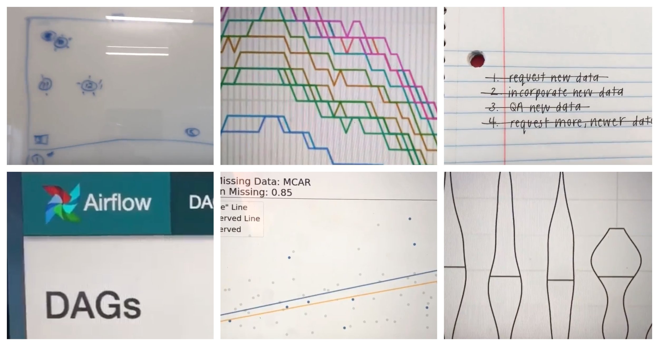
PS: Here's a full description of each snippet, in case you're curious:
Reviewing a design for a test of our hardware to be run in stores.
Working through my daily to-do list. This one includes incorporating and QA-ing a new set of data into our workflow.
Getting the word out about a panel that a few fellow data scientists and I are pitching for SXSW.
Visualizing test results with violin plots(!). A great way to combine and display data from a test on the distribution of signal strength.
Updating SQL case statements in our data ETL pipeline to account for a new case.
Writing pseudo-code documentation for a classifier so that others can understand the data that goes into it, the logic behind it, and are able to explain it in more simple terms to customers.
A quick shot of a “lab” we use to test equipment before it goes in the field. This was a test-heavy month.
This is the face I make approximately a dozen times per day when I'm questioning something I see in the data. I’m getting wrinkles from making this face.
This was a SQL-heavy month, since we were spending lots of time QA-ing our data.
Using Jupyter to spin up some quick exploratory data visualizations to present to answer a question my team had.
Playing with a cool way to visualize the impact of missing data at JupyterCon.
Dinner with R-Ladies NYC! I've had a lot of fun meeting R-Ladies when visiting various cities, and this was no exception -- it's nice to have a built-in group of people to hang out with in cities all around the world.
Swag from the Netflix booth at JupyterCon -- read about all of the cool things they're doing in my Jupytercon recap.
Building and visualizing an ad-hoc analysis request from a client.
After making some changes to our data pipeline, monitoring the DAGs in Apache Airflow to make sure everything updates smoothly.
More data visualization while bug-hunting to spot the source of an error in our data pipeline.

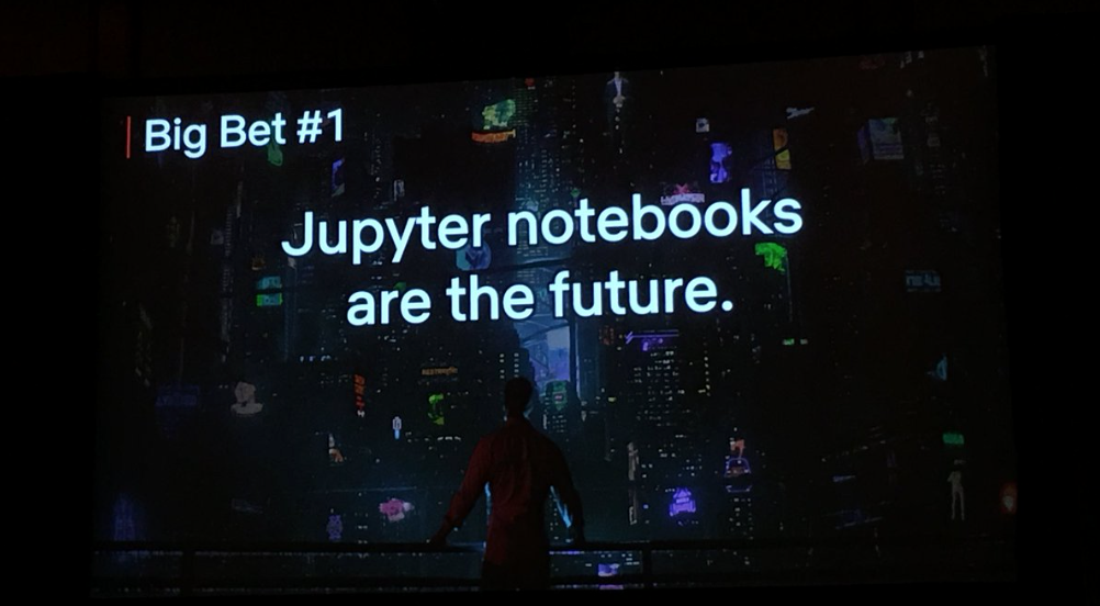
The Coolest Things I Learned at JupyterCon
I’m freshly back from JupyterCon in NY and still feeling the bubbly optimism that comes with bringing all you’ve learned at a conference back to your office. In that spirit, I wanted to share some of the coolest and most interesting things I learned with you all.
I’m freshly back from JupyterCon in NY and still feeling the bubbly optimism that comes with bringing all you’ve learned at a conference back to your office. In that spirit, I wanted to share some of the coolest and most interesting things I learned with you all.
One quick note before we dive in: I was able to attend JupyterCon because of a very generous scholarship awarded jointly by JupyterCon and Capital One. I would not have been able to attend otherwise and I’m very grateful to these two groups for their commitment to diversity and inclusion in the tech community, so a big thank you to both groups.
In no particular order, here are some of the most interesting things I learned at JupyterCon:
Jupyter Notebooks, Generally
You can add a table of contents to a notebook(!) using nbextensions. (h/t Catherine Ordun)
You can parameterize notebooks, create notebook templates for analysis, and schedule them to run automatically with Papermill. (h/t Matthew Seal)
There are a few cons to teaching and learning with Jupyter notebooks that are worth knowing and acknowledging. Joel Grus’s ‘I Don’t Like Notebooks.’ was a cautionary tale on the use of Jupyter notebooks for teaching, and while I don’t agree with all of his points, I do think it’s worth the time to go through his deck.

29540207-a3d892fe-86cd-11e7-8476-54c79d9f8d7c
Notebooks in Production (!)
Netflix is going all-in on notebooks in production by migrating over 10k workflows to notebooks and using them as a way to bridge the chasm between technical and non-technical users. (h/t Michelle Ufford)
“Notebooks are, in essence, managed JSON documents with a simple interface to execute code within”. Netflix is putting notebooks into production by combining the JSON properties of notebooks with open-source library Papermill. (h/t Matthew Seal)
On debugging: by running a notebook on a notebook server against the same image, you can fix issues without needing to mock the execution environment or code, allowing you to debug locally. (h/t Matthew Seal)
On testing: templated notebooks are easy to test with Papermill -- just run tests with a scheduler using parameters like what a user would be inputting to hydrate and run the notebook (and look for errors). (h/t Matthew Seal)

Screen Shot 2018-08-27 at 1.26.53 PM
Data Science in Jupyter Notebooks
One of my favorite new-to-me ideas is to build your own Kaggle-style board to make iterating and judging performance of internal models more fun (and provide incentive to track them better!). (h/t Catherine Ordun)
In graph/network analysis, you can connect nodes using multiple edges (characteristics) using a multigraph. (h/t Noemi Derzsy’s great tutorial on graph/network analysis, which I learned a lot from)
There is a ton of research out there around visualization, including on human perception, that can and should be leveraged for creating impactful data visualizations. I highly recommend Bruno Gonçalves’s slide deck as tour de force of what we know about perception and how to apply it to data.
In a very cool use of Jupyter notebook widgets, “see” the impact that missing data can have on an analysis (in this case, a linear regression), check out the interactive-plot notebook from Matthew Brems’ missing data repo, which also contains reading materials and a great slide deck.
I finally figured out how all of the parts of a matplotlib figure go together thanks to this nifty visualization from the matplotlib documentation. (h/t Bruno Gonçalves)

… So yeah, I learned a lot of really cool things from some very talented people at JupyterCon this year. I’m excited to build new data products, apply network/graph analysis to IoT data, play with widgets, and maybe put a notebook or two into production.
If you’re doing cool things with notebooks at your company, I’d <3 to hear about them. Feel free to leave a comment here or ping me on Twitter.
[Title image credit: Jason Williams]

Better Allies
In hopes that others can follow their example, I’d like to share some of the things that “good guys in tech” have done to help my career.

During my 7+ years in tech, I’ve encountered sexism, but I’ve also had the good fortune to work with some really great guys. These guys cared about me and my work, and lots of the small things they did to help me (sometimes without realizing they were doing anything!) added up to big things for my career over time.
In hopes that others can follow their example, I’d like to share some of the things that “good guys in tech” have done to help my career:
Sharing positive feedback (with my boss)
Over the years, some of my consulting clients made an effort to praise my work *in front of my boss*, which directly helped me to get promoted.
Each promotion has meant more experience, more skills, and higher compensation -- in addition to helping to set me up for the next step(s) in my career.
Recommending me
I got my last job because a guy on my future team recommended that his boss take a look at my resume. My resume got screened out through their recruiting process, so I know that I literally would not have gotten the interview if it weren’t for his recommendation. It's hard to understate how important that recommendation was for my career.
Similarly, many former coworkers and clients have also written formal recommendations for me on LinkedIn, which helps to build trust in my work and establish credibility beyond a single job or boss.
Sharing salary information
I had a male coworker who started in the same position as me, was promoted to a manager role, then switched to a new company. Before he left, he shared his salary in my position, after being promoted, and at his new company.
This helped me to navigate salary negotiations (both internally and externally), ensure that I was being paid fairly, and to evaluate new job offers. Knowledge is power when it comes to salaries and a little bit of “extra” information can go along way.
Sponsoring me
My last company had a highly selective quarterly awards program. My boss put time and effort into my nomination, then went to his boss to ask that he throw his weight behind the nomination as well to give me a better shot at getting the award. I got the award, and I’m positive that having the extra backing had an impact.
This is the difference between mentorship and sponsorship -- a mentor might help you gain the skills to earn an award, but a sponsor will nominate you, then go to bat to personally advocate for you. A sponsor has skin in the game. Women are over-mentored and under-sponsored, and we need people with social and political capital to promote us and help us to advance.
Asking about parental leave policies publicly (and lobbying for better ones!)
During an HR / benefits session, a male coworker asked about parental leave so that I wouldn’t have to. It can be quite awkward to have people assume that you’re pregnant (or soon to be) if you’re talking about parental leave policies, and this saved me from having those uncomfortable conversations.
The same guy also wrote a letter to the CEO citing his experiences and how a flexible schedule helped him and his family during pregnancy and beyond. Parental leave helps everyone!
Promoting my work (even Twitter helps!)When someone references things I’ve written or retweets the things I’m working on, it helps to amplify my message and build my network.
This also provides potential for new opportunities and conversations with people I may not have reached otherwise. (Plus, it never hurts to have people supporting you and talking about your work!)
Supporting women-focused groups
Before launching R-Ladies Austin, we had several men reach out to see how they could help us grow. They offered time, training materials, books for raffles, advice, meeting places, sponsorships, speaking opportunities, and more. This helped a lot as we were getting established.
Similarly, our local Austin R User Group goes out of their way to promote R-Ladies events without me even asking. This helps us to expand, reach new members, and makes us feel supported and welcome in the tech community.
Empathizing (and humor doesn’t hurt!)
I’ve been lucky to have male coworkers who at least try to “get it” when it comes to gender in tech, and who have had my back during tough moments. Some of my favorite coworkers have made laugh out loud after being frustrated by something casually sexist that a client said. That stuff is the worst, and a little bit of empathy and humor can go a long way.
Working to improve gender ratio at tech events
Quarterly, our R-Ladies group teams up with the larger user group for a joint meetup, and recently we asked for volunteers to give lightning talks and ended up with more speakers than slots (a great problem to have for an organizer).
I was prepared to step down to give my slot to another woman in our group. Instead, the male organizer chose to give up his slot so that the event would have a higher women-to-men gender balance. To me, this small action speaks volumes about the type of inclusive tech community we’re working to build here in Austin.
Being a 50/50 partner at home
My husband has picked up domestic “slack” while I study, organize meetups, attend workshops, and travel to conferences (among other personal pursuits). I’m all about being a hashtag-independent-woman, but the dogs still need to go out even if I’m doing back to back events after work.
The balance of responsibilities shifts from week to week, but in the end, we’re partners and teamwork is what makes it all work. The fact that my husband supports my career and is happy to help out at home makes more things possible.
Asking what men can do (better)
A former boss tries his hardest to promote women in tech, and one of the things he’s done best is ask for specific ways that he can be most helpful. This has lead to lots of productive conversations around things like hiring and mentoring.
The act of asking also lets me know that he’s open to feedback and questions. This list started in large part because he’s constantly asking for concrete, actionable ways that he can help women in tech, and I appreciate that.
**
But wait, there’s more!
All of the above are things that good guys have done for me personally. I asked my network on Twitter whether they had any personal experiences and got lots of feedback. Here are more great (concrete and actionable) ways that men in tech have helped women in my personal network:
Helping brainstorm talk proposals (via Stephanie)
Offering training to help women build their skillsets (via Susan)
Literally just saying "well done", "that was great", "I'm impressed", etc. (via Alexis)
Fixing a salary discrepancy after investigating and realizing a woman is underpaid (via Angela)
Letting women know that you have confidence in them (via Mara)
Supporting women while they are out on maternity leave (via Elana)
Asking point-blank, "What is holding you back?" and helping (via Alison)
One more thing
Ladies, if there's a concrete action that someone has taken to help your career, I'd love to hear about it in the comments or on Twitter [I'll update this post with any new suggestions].
Also, it's worth mentioning that none of the above actions are gender specific -- plenty of women have helped my career as well (in similar and different ways) -- or specific to tech. Anyone can make a big difference on someone's career -- these are just a few ways that some good guys have helped mine, and I hope they help illustrate small, concrete ways that we can all be better allies to one another.

A Data Science Tour of Duty

In September 2015, I was looking for a job in Austin and started interviewing at Yodle, a marketing tech company. Yodle was looking for someone with experience in data and predictive analytics, and I was looking for a company where I could learn how to code and work on new, interesting problems. It was a good match, but one thing that made this opportunity stand out was the way that my soon-to-be boss described what my time there would be like -- a “tour of duty”. Tim was building a data science-y team and was testing out a management framework he had discovered called “The Alliance”. I was intrigued.
A tour of duty?
I’ll pause here for a quick explanation of The Alliance and the tour of duty concept.
The Alliance was created by LinkedIn cofounder Reid Hoffman to address a lack of trust and alignment between employers and employees in a networked age. The gist is that since pensions aren’t really a thing in tech and most people no longer spend a lifetime at the same company, employees behave more like free agents -- they are willing to leave a position when the next good thing comes along without concerns about loyalty to their employer.
The Alliance outlines a new employer-employee compact where employers can retain employees better by being open and honest about this situation and focusing on how they can add mutual value to each other. One way to do this is to establish a tour of duty for each employee -- a commitment by both parties to a specific and mutually beneficial mission (with explicit terms) to be accomplished over a realistic period of time. For a more thorough explanation, check out the visual summary below.
There are some other key components of The Alliance beyond the tour of duty that I’m not going to outline here. The framework for having open and honest conversations about career goals and timelines was also interesting and impactful for me, and worth a read if you’re interested.
My tour of duty
My transformational tour of duty started with making some goals to be incorporated into a formal growth plan. (One crucial piece of The Alliance is that the mutual agreement between employers and employees should be written down, which includes the things that each party hopes to achieve during the tour of duty.) My initial goals included learning to code, doing innovative data analysis, and learning to automate things, all of which would be put to use on a project to build in some automation around our A/B testing.
Building trust incrementally is another facet of The Alliance -- the relationship deepens as each side proves itself. I wanted to learn how to code, and Tim gave me about two months of paid development time to ramp up on company practices and learn to code before diving into analyses. This built trust for me immediately, and because my boss was willing to invest in me, I was happy to invest in his mission and doing great work for our team.
The timeline we set for this first tour was about two years, and especially at the end of my ramp-up period, I was feeling really good about it. We did weekly 1:1’s to check in, and I was able to freely talk about how my goals were changing as we accomplished things along the way.
...Okay, multiple tours of duty
Four months after I started, Yodle was acquired by Web.com. If you ever want to throw a wrench into long-term job plans, an acquisition really is a great way to go. Due to several shakeups that were beyond my boss’s control, I actually ended up completing three distinct tours of duty -- one in marketing analytics and automation, one in product analytics (including feature research and user behavior) and a final tour in production machine learning and data science.
During these times, Tim let me know when he was having doubts about projects or when tectonic shifts in our organization’s structure were coming. His openness and honesty empowered me to be open and honest. At one point, I told him that I didn’t want to do product analytics work -- my job at the time -- anymore. (Note: I actually like product analytics, but I really wanted to learn how to build machine learning models and put them into production.) My goals had grown with my skillset, and he added me to a team where I could pick up these new skills while continuing to add value to the business.
Multiple shorter tours was definitely was not what we initially planned, but we were able to be agile and adjust as needed, and I’m grateful to have gained valuable experience in multiple arenas. My last tour in particular was exactly the kind of transformational launchpad that we talked about when I first joined.
The end of the road
Tim had always been very up-front that if my dream job came along, I should take it. In turn, he let me know when he was contacted by dream-job-level prospects, and kept me up-to-date on how he was feeling about his role, his missions, and his career path. When I had an inkling of when it would be time for me to move on, I told him.
Another goal of The Alliance is to extend the relationship between employer and employee to be a lifetime relationship that exists beyond the scope of a single job. I feel really good about this. I’d love to work with Tim again because I know he cares about my career beyond a single job, and he demonstrated this by giving me the opportunity to work on projects that would grow my skillset and enable me to move on to the next thing.
Post-tour thoughts
If I had the chance to work within The Alliance framework again, I'd take it.
The Alliance is rewarding, but it's also tough. It takes commitment from both parties and a lot of gradual trust to get the point where you can talk openly about your career beyond the scope of a single job (but once you get there, it's worth it). When plans changed or gave way to new ones, being able to talk openly and honestly about what was and wasn't working allowed me to build my skills while helping the company with its goals -- a win-win.
My tour of duty was a transformative step in my career, exactly as it was designed to be. With a roadmap, a reasonable amount of time to dedicate, and a clear explanation of how my projects would be mutually beneficial to me and the company, I was enthusiastic about my work. I was given the opportunities I needed to learn new skills, build cool things, and work with great people. As my time at Web.com comes to an end, I'm happy, well-equipped, and ready to start my next tour of duty.
**
If you've worked under The Alliance framework, I'd love to hear about your experience and whether there's anything you might add or change -- feel free to ping me on Twitter.

One Year of R-Ladies Austin 🎉
Today marks one year of R-Ladies Austin! The Austin chapter started when Victoria Valencia and I emailed R-Ladies global (on the same day!) to ask about starting a local chapter. It was meant to be -- the ladies from R-Ladies global introduced us, and the rest is history.
For anyone who hasn’t heard of R-Ladies, we are a global organization whose mission is to promote gender diversity in the R community by encouraging, inspiring, and empowering underrepresented minorities. We are doing this by building a collaborative global network of R leaders, mentors, learners, and developers to facilitate individual and collective progress worldwide. There are over 60 R-Ladies chapters around the world and we continue to grow!
Here in Austin, it’s been a busy year. So far, we’ve hosted 16 meetups -- including seven workshops, two book club meetings, two rounds of lightning talks, a handful of happy hours, a movie night, and a visit from NASA.

To celebrate our first R-Ladies anniversary, I thought it would be fun to answer some questions with Victoria around our journey so far:
What has been the best part of working with R-Ladies?
Victoria: The best part has been connecting with women in our community that share similar passions and interest in data! It has been so fun. Also, the R Ladies hex stickers are pretty awesome. :)
Caitlin: It’s been great to be a part of such a supportive community and to meet so many brilliant women, both here in Austin and in other cities. Since joining R-Ladies, I’ve built a great network, learned cool things, and had a lot of fun along the way.
Have you had a favorite meetup so far?
Victoria: My favorite meetup by far was our book club for Dear Data by Giorgia Lupi and Stefanie Posavec. We started by discussing the book and the types of visualizations and data Giorgia and Stefanie shared with each other. Some were funny and some were sad but all of them were inspiring! We followed by creating our own visualizations in a postcard format of the beer list at Thunderbird Coffee. Who knew a beer list could be so fun to visualize and that each of us would think to do it in such different ways! It was a blast.
Caitlin: I love the book club meetups too -- it’s a great space because we can do anything from have deep discussions on the ethical impacts of algorithms in society (I’m looking at you, Weapons of Math Destruction) to getting really creative and using colored pencils to dream up artistic ways of visualizing data. I also loved having David Meza come down from NASA in Houston to talk about knowledge architecture. It would be an understatement to say that he’s been supportive since day one, because he actually reached out to us long before our first meeting. (I guess “supportive since day -75” doesn’t have quite the same ring to it, but it’s true.)
What’s the biggest thing you’ve learned after one year of organizing R-Ladies?
Victoria: That managing a meetup is a fair amount of work, but certainly worth the effort! I have also learned that the R Ladies community is strong and close knit and super supportive! It has been great connecting and learning from them.
Caitlin: I agree with Victoria's take -- managing is a lot of work but also *very* worth it. I’ve learned a lot about building community through collaboration. Working with other local meetups has helped us to expand our reach and provide more opportunities for the women in our group. It's also been very cool to learn more about the tech community on Austin. We've been fortunate to receive lots of support from local companies and other tech groups, and it's been nice to get more plugged in that way while building a distinct community that adds something new to the mix.
How has R-Ladies helped you (personally or professionally)?
Victoria: R-Ladies has helped me by allowing myself time to learn about cool R stuff I did not know before! It has helped me to learn more efficient ways of coding by going through all of the chapters of R For Data Science, how to relax with colored pencils, data, and beer, and that opened my mind to different perspectives from fellow R-ladies about the continually evolving and expanding world of data that surrounds us.
Caitlin: I can't say enough good things about the R-Ladies community. The individual chapters help to build local communities and strong networks of highly-skilled women, and the global chapter works hard to promote the work of R-Ladies to the larger global community, including people who might not see that work otherwise. Especially since a lot of women are one of few women on their team (or the only woman on their team), it's great to have a network who can relate and provide feedback and advice (on all sorts of things) when you need it. On a personal level, I've built relationships with amazing women (both in real life and virtually) through R-Ladies, and it's opened up some opportunities that would have taken a lot longer to find on my own.
*
The next 12 months
We’ve grown a lot this first year (we’re over 275-strong!), and we’re hoping to grow even more in the next 12 months. If you're in Austin and haven’t made it out to a meetup yet, we’d love to meet you! We’re beginner friendly, positive, and dedicated to promoting gender diversity in the R Community (and tech in Austin more generally). And even if you are just interested in data and maybe learning more about R we want you to join us as well!
If you're not in Austin, but want to support R-Ladies, I'd encourage you to check out R-Ladies directory the next time you're looking for speakers or for local women to reach out to -- there are lots of women out there doing amazing things, and R-Ladies is making it easier and easier to find and connect with them.
The two biggest things that we'll need in the next 12 months are speakers and space. If you use R and have learned a cool thing, discovered a neat package, done an interesting analysis, or have anything else you want to share, we'd love to hear from you. And if you have space available, we're always looking for new spaces to host the various types of meetups we put on. Please get in touch with us; we'd love to hear from you!
Thanks for a fantastic year, and looking forward to the next 12 months!
Cheers,
Caitlin and Victoria

Only 60% Sure
I have a fantastic coworker who I've been pair programming a lot with lately, and he does one thing that I wish everyone did.
I have a fantastic coworker who I've been pair programming with a lot with lately, and he does one thing that I wish everyone did:
He has a habit of stating something (usually an answer to a question I've asked), and then after a beat, saying something like, "I said that very confidently, but I'm only about 60% sure". This is usually followed by a suggestion to firm up his answer, like "you should ask X person", "you should try it and see what you think", or "you should maybe research that more".

Here's why I love that follow-up response so much:
This answer builds my trust in him (because I know he'll admit if he doesn't know something), and builds my confidence in his answers overall. On the flip side, if he makes a statement and doesn't qualify it with some level of uncertainty, I trust it as-is and don't feel like I need to research it or double-check afterwards.
This models great behavior around questions for our org as a whole by making "I'm not sure" an acceptable way to answer to a question. By including additional suggestions of ways that I can get answers in his response, he's setting me up to find the best possible answer, which is better and more efficient than getting an incomplete answer from someone who might not be the best person to cover a given subject area.
This encourages more questions. I'm not afraid to ask tough or opinion-based questions because I know I'll get a thoughtful and balanced answer. Asking more questions has led to a deeper understanding of the technologies and products I'm working with -- a win-win for him, for me, and for the company.
Since I've heard him say this, I've started incorporating it into my own conversations, both professional and personal. It's a small thing, but it makes a big difference in the way we interact, and I would love to see more people adopt this habit.

Imposter Syndrome in Data Science
Thoughts on why imposter syndrome is so prevalent in data science, how I deal with it personally, and ways we can encourage people who are feeling the impact.
Lately I’ve been hearing and reading lots about imposter syndrome, and I wanted to share a few thoughts on why imposter syndrome is so prevalent in data science, how I deal with it personally, and ways we can encourage people who are feeling the impact.
Why is imposter syndrome so prevalent in data science?
Data science has a few characteristics which make it a fertile ground for imposter syndrome:
Data science is a new field.DJ Patil and Jeff Hammerbacher were the first titled “data scientists” only about 7(!) years ago (around 2011). Since then, as we’ve all been figuring out what data science *is*, differing definitions of “data scientist” have led to some confusion around what a data scientist should be (or know). Also, because “data science” wasn’t taught in colleges (as such) before then, the vast majority of data scientists do not have a diploma that says “data science”. So, most data scientists come from other fields.
Data science is a combination of other fields.Depending on who you ask, a data scientist is some combination of an analyst / statistician / engineer / machine learning pro / visualizer / database specialist / business expert. Each of these are deep positions in their own right, and it’s perfectly reasonable to expect that a person who comes to data science from any one of these fields will have significant gaps when it comes to the other fields on the list.
Data science is constantly expanding with new technologies.As computer memory becomes cheaper, open-source becomes more popular, and more people become interested in learning and contributing to data science and data-science-adjacent fields, the technology surrounding data science grows at a very healthy rate. This is fantastic for the community and for efficiency, but leads to lots of new technologies for data scientists to learn and a culture where there is pressure to stay “on top” of the field.
So, we have people from a variety of backgrounds coming to a new field with many applications whose boundaries aren’t clearly defined (thus causing inevitable gaps in their knowledge of that field as a whole), and where technology is changing faster than a single person can keep up with. That is the plight of a data scientist in 2018, and why so many people feel the effects of imposter syndrome.
My Secret for Dealing with Imposter Syndrome
Every single data scientist that I know (and you know) is learning on the job. It might be small stuff (like cool tools or keyboard shortcuts) or bigger stuff (like new algorithms or programming languages), but we’re all learning as we go, and I think it’s crucial that we acknowledge that. For me, it’s simultaneously really exciting to be in a field where everyone is learning, and also kind of intimidating (because what if the stuff I’m learning is stuff that everyone else already knows?), and that intimidation is a form of imposter syndrome.
The way that I’ve dealt with imposter syndrome is this: I’ve accepted that I will never be able to learn everything there is to know in data science -- I will never know every algorithm, every technology, every cool package, or even every language -- and that’s okay. The great thing about being in such a diverse field is that nobody will know all of these things (and that’s okay too!).
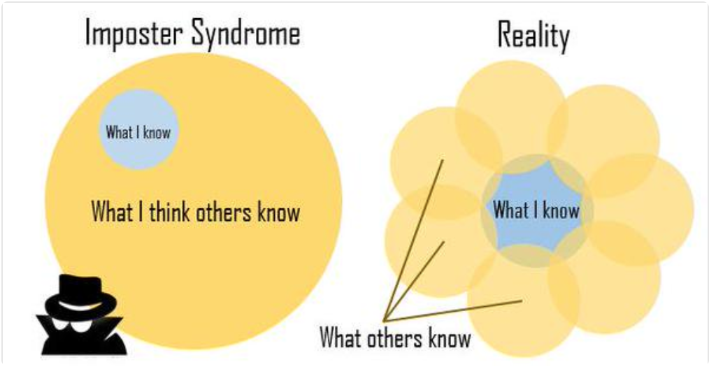
I also know that I know things that others don’t. I’ve built predictive models for dozens of colleges and non-profits, have experience on what it takes to create and analyze successful (and unsuccessful!) A/B tests, and am currently learning how to do machine learning models in production. These are not skills that everyone has -- there are people who know more about computer science than I do, or machine learning, or Macbook shortcuts -- and that’s okay. Diversity is a good thing, and I can learn from those people. There’s a great Venn diagram which illustrates the relationship between what you know and what other people know, and how they overlap. What you know is rarely a subset of what other people know; your knowledge overlaps with others and also sets you apart from others.
Community-wide Techniques for Reducing Imposter Syndrome
If we can agree that all data scientists are learning on the job, I think the best things that we can do for reducing imposter syndrome in the larger data science community are to be open in acknowledging it and to work towards fostering a healthy learning environment.
Get comfortable with “I don’t know”
I love when people say “I don’t know”. It takes courage to admit when you don't know something (especially in public) and I have a great deal of respect for people who do this. One way that we can make people more comfortable with not knowing things is to adopt good social rules (like no feigning surprise when someone doesn’t know a thing, and embrace them as one of today’s lucky 10,000 instead).
Don’t “fake it ‘til you make it”
Sure, it’s good to be confident, but the actual definition of an imposter is someone who deceives, and I think we can do better than “faking it” on our way to becoming better data scientists. “Faking it” is stressful, and if you get caught in a lie, can potentially cause long-term damage and loss of trust.
Encourage questions
The benefit to asking questions is two-fold:
1) You gain knowledge through conversation around questions
2) Asking questions publicly encourages others to ask questions too.Asking questions is exactly the kind of thing data scientist should be doing, and we should work to encourage it.
Share what you’re learningWhen I see others share what they’re learning about, it helps me put my own learning in perspective -- and whether I know much about the topic or not, it’s encouraging to see other people (especially more experienced people) talk about things that are new to them.I’ve started a personal initiative to track the things I’m learning each week on Twitter using the hashtag #DSlearnings. Feel free to have a look at the archives (I’d love to chat if you’re learning similar things!), and to add your own learnings to the hashtag.
A little bit of transparency goes a long way towards staving off imposter syndrome. We can embrace both being knowledgeable and not knowing things -- and do so in public.
**
I’d love to hear ways that others deal with imposter syndrome, and about things you’re learning (feel free to use #DSlearnings or make your own hashtag!) along the way.
PS: Thank you to @jennybryan and @dataandme for the Venn diagram!

Reading List: 2017 Edition (and some thoughts on resolutions)
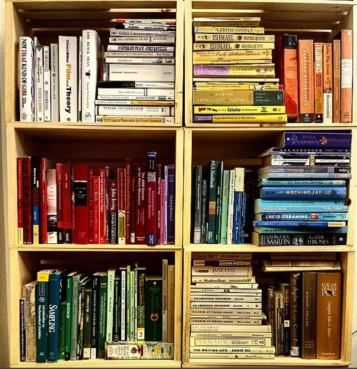
My not-so-secret secret? I was an English major. I also majored in Stats and love math and data science, but I have always and forever loved reading. In an effort to read more often, each year I set a goal* of reading 25 books. So, in the spirit of Susan Fowler, and with the hope of getting good book suggestions, I want to share my 2017 reading list (with brief commentary). My top five recommended reads are designated with **.
1. The Great Gatsby, by F. Scott Fitzgerald
I don't have much to say about The Great Gatsby that hasn't been said already, but I can say that it was much more interesting than I remember it being in high school -- and that I really, really want to go to a Gatsby party.
2. Men Explain Things to Me, by Rebecca Solnit
The word "mansplaining" was coined in reaction to Rebecca Solnit's titular essay "Men Explain Things To Me", which begins with a situation women might find vaguely familiar: after Solnit mentions the topic of her most recent book, a guy at a party asks if she's heard of another *very important* book on the same topic, and it takes her friend's repetition of "That's her book" three or four times to sink in and leave the man speechless. The essay is short, and definitely worth a read, and the book does a good job of adding color to mansplaining and other gendered issues through added data and commentary, including a thoughtful, well-researched take on domestic violence that I hadn't heard before.
3. Lean In, by Sheryl Sandberg**
I realize that I'm several years late to the game, but after finally reading Lean In, I would recommend it at the level of "required reading" for women navigating corporate America (and the tech world in particular). Sheryl Sandburg provides solid examples (and data!) on gendered differences in salary negotiations, likability, speaking up, explaining success, applying for level-up positions, getting promotions, ambition, and so much more. Reading this book inspired me to speak up (even about the little things!), and I've saved many of the factoids for future reference as I'm navigating my own career. Seriously, ladies, read this book if you haven't already!
4. Hillbilly Elegy, by J.D. Vance
Hillbilly Elegy interweaves two stories: J.D. Vance's personal story of "making it out" of a Glass-Castle-esque "hillbilly" upbringing by joining the Marines, going to college, and eventually law school at Yale, and a more general look at the problems confronting the modern white working class (in Appalachia and similar regions). The most interesting piece, for me, was a specific example of a town whose blue-collar factory jobs eventually dried up, and the impact this has on the town (focusing on home prices, lack of mobility, and personal pride, to name a few). The book is eye-opening, and I liked that it focused on facts as well as personal experience to paint a picture of the modern-day hillbilly's plight.
5. Ender’s Game, by Orson Scott Card
Ender's Game makes consistent appearances on reddit must-read lists, so I finally gave it a whirl and ended up liking it. This sci-fi novel focuses on a future where Earth is attacked by aliens and specially selected children are given military tactical training through a series of battle simulations ("games") to fight aliens and protect humankind (all in zero gravity!). The book follows Ender, one of the chosen children, from normal childhood life through battle school, with a twist ending to boot.
6. The Girl with the Lower Back Tattoo, by Amy Schumer
While there's plenty I love about Amy Schumer's comedy, her autobiography was mostly repetition of stories I'd heard from her standup / interviews / etc. I'd skip it and watch her skits instead.
7. Brave New World, by Aldous Huxley
Another high school assignment, another worthy re-read. I went through a heavy dystopian novel phase in 2016, and this was the tail end. From gene therapy to pharmaceuticals to race relations to hookup culture, I think Brave New World is still, 86 years later, an incredibly relevant (and surprisingly current!) take on "modern" issues. (It would also make a great episode of Black Mirror.)
8. The Rational Optimist, by Matt Ridley
The central argument of this book is that things are better now than they ever have been (and they're continuing to get better) -- mostly due to trade and specialization among tribes of humans. I read this not long after Sapiens, which definitely colored my thinking (they're actually "You Might Also Like..." pairs on Amazon). The Rational Optimist doesn't have the breadth of Sapiens, but it covers the history of trade and specialization in much greater depth, and provides interesting historically-informed commentary on modern-day hot topics like fossil fuels, government, and war. (Full disclosure: this is my boss's favorite book and there's something cool about reading your boss's favorite book and seeing where it might impact their perspective.)
9. The Argonauts, by Maggie Nelson
I discovered Maggie Nelson via Bluets, her poetic lyrical essay about a woman who falls in love with the color blue (which I *loved*). The Argonauts is a completely different "family" of story -- a genre-bending take on parenting and romance that focuses on Maggie's own queer family and relationship with fluidly gendered Harry Dodge. Maggie is open, brutally honest, and thoughtful, and I appreciate her sharing such personal experiences.
10. The Girl on the Train, by Paula Hawkins
Thriller. Girl (woman) on train sees a couple out the train window every day, and daydreams about their "perfect" life -- UNTIL one day she sees the woman kiss another man and that woman goes missing... If this sounds interesting to you, you'll probably like this book. It's a quick read, has a few twists, and was perfect for filling time on a flight from Austin to Boston.
11. How to Make Friends and Influence People, by Dale Carnegie
Dale Carnegie's advice on making friends and influencing people is timeless. This book is still getting updated and reprinted 75 years after its original publication, and still relevant (though some of the original examples are a little -- charmingly -- dated). If you're interested in the basic techniques, the Wikipedia article does a good job of describing Carnegie's basic system, but the book itself is a quick read and one I'd recommend.
12. The Undoing Project, by Michael Lewis
I love Michael Lewis books. The Undoing Project is another good one, focusing on the relationship between Daniel Kahneman and Amos Tversky, who together created the field of behavioral economics. Lewis, as usual, does a great job of explaining fairly technical concepts while weaving a really interesting story around the complex relationship between two men. This book is at turns triumphant and heartbreaking, and the research itself was interesting enough that I'd recommend it.
13. It, by Stephen King
My husband and I both read It this year in preparation for the new movie (which was so much better than the original!). This was my first Stephen King novel and won't be my last.
14. The Heart, by Maylis Kerangal**
I read this book solely based on Bill Gates' recommendation and I'm so glad I did. This is technically the story of a heart transplant, but it is actually much more than that -- a beautiful, gripping look at the fragility of life and family and relationships. The poetic language provides a strong contrast between the family whose life is forever changed with the matter-of-factness for the medical professionals involved in the story (for whom this is a normal "day at the office"). This book is an experience (I cried more than once), but a highly recommended one.
15. My Own Words, by Ruth Bader Ginsburg
There is so much about Ruth Bader Ginsburg that I find inspiring -- her drive to make it to the Supreme Court, her work on gender equality and women's rights, her relationship with her husband, her ability to see beyond political views and build cross-aisle friendships, and even her workout regimen (at age 84!) are all reasons to look up to RBG. Her book focuses on specific court cases and is peppered with interesting details about life on the Supreme Court. I found her book a bit repetitive (as some of the cases are cited multiple times) but overall a good in-depth look at the life of an important women "in her own words". I'm definitely a fan.
16. Sprint, by Jake Knapp
Sprint is like a time machine for business ideas: a process to get a team from concept to prototype with customer feedback in a single week. I read this book after hearing about the concept from the UX team at Web.com (where I work), who have developed several product features that are the direct result of sprints. If you work on a product team and are interested in ways to test and fast-track development ideas, I'd recommend this book.
17. Option B, by Sheryl Sandberg
Option B is a look at building resilience through loss, disappointment, and heartache. After the sudden loss of her husband, Sandburg took some time off to pick up the pieces -- of her family, her job, and everything else -- and this book tells that story. Like Lean In, Option B is a combination of experiences and research, and like Lean In, it's full of interesting stories and practical advice -- like how to be there for someone going through a loss (and the importance of questions like "What do you not want on a burger?". This one resonated for me personally after the sudden loss of my father, and I spent so much time thinking about my mom that I eventually just sent her a copy. If you've ever wondered what to say or how to help someone who has experienced loss, check out this book.
18. Switch, by Chip and Dan Heath
The tagline of Switch is "How to change when change is hard". This book focuses on an eight-step process for making change and introduces the idea of clearing a path for the elephant and the rider -- the elephant being your emotions, big and hard to control, and the rider being your rational side, technically "in-control" but sometimes not enough to overcome your emotional side. Creating a clear path that addresses the needs and interests of both the elephant (emotions) and rider (rational thinking) is a means for making change "stick". My boss and I both read this book and it provided a useful framework and shorthand that we've used while trying to make organization-level changes.
19. Mammother, by Zachary Schomburg**
Zachary Schomburg is one of my favorite poets (his book Scary, No Scary is an all-time favorite), and a few years ago, he announced that he was working on his first novel -- I have been looking forward to reading Mammother ever since and it did not disappoint. Mammother is the story of a town suffering from a mysterious plague called God's Finger that leaves its victims dead with a giant hole in their chest. There is a large cast of characters, plenty of magical realism (ala Marquez), and dense, beautiful language to support a surprisingly emotional story (I cried on a plane at the ending). If you like poetry, magical realism, or weird, cool reads, I highly, highly recommend this book (and all of Schomburg's poetry, for that matter).
20. Between the World and Me, by Ta-Nehisi Coates**
This is one of those books that totally changed my perspective. Between the World and Me is a letter from Coates to his son about the experience and realities of being black in the United States. In addition to being beautifully written, this book covers territory I didn't know existed -- on the relationship between fear and violence, on Howard University, on how different race is experienced in the US than other countries without a history of slavery, on bodily harm, and so much more on "being black". I wish this was required reading and can't recommend it enough.
21. A Column of Fire, by Ken Follett
A Column of Fire is the third book in the widely spaced "Kingsbridge" series (which starts with The Pillars of the Earth, written in 1990). I was shocked to find that there was a third book in this series and downloaded it immediately. Each book is engaging historical non-fiction, and focuses on the political intersection of government and religion (and those who exploit either -- or both). A Column of Fire is an apt addition -- interesting storyline, lots of characters, and a cool take on historical events, particularly Mary, Queen of Scots. It's worth noting that while this is part of a 'series', the books stand perfectly well on their own -- though I would still start with The Pillars of the Earth if you're interested.
22. Dear Data, by Giorgia Lupi and Stefanie Posavec
Dear Data is a project created by two women (Giorgia and Stefanie) getting to know each other by sending weekly postcards based on self-collected and visualized data -- like "how many times I swore", "every time I looked in the mirror", and "how many times I said 'sorry'". The data is interesting, and the visualizations and engrossing -- so much so that the collection of postcards was purchased by MoMA for display. We kicked off the R-Ladies Austin book club by reading this, and creating our own postcards, which was so much fun -- and made us realize that the data collection and visualization process is not nearly as easy as it looks!
23. Milk and Honey by Rumi Kaur
Milk and Honey is a poetry book in four chapters: "the hurting", "the loving", "the breaking", and "the healing". Kaur provides an intense look at each emotion in turn. I have to admit that I didn't love this book. While I appreciate brutal honesty in poetry (and there is plenty in here), the translation of feelings to language read as a bit like teen-angst, which was a turn-off.
24. Weapons of Math Destruction by Cathi O’Neil**
Weapons of Math Destruction is a look at the algorithms pervade modern life -- and the problems embedded within them. This book does a great job of explaining the ethical implications of collecting and using data to make decisions, and outlines a framework for creating responsible algorithms. After reading this, I'm noticing new algorithms and data issues almost weekly, so it's definitely had an impact on my thinking and approach to creating algorithms and working with data. I think this will resonate with "data people" and everyone else (the examples jump from teachers to credit cards to court systems). Also, a quick shameless plug: this is the next book for the R-Ladies Austin book club, so if you want to discuss it in person, please join us on Jan 31!
25. A Little Princess by Frances Hodgson BurnettI loved this movie growing up, and after my mom bought me the book, I devoured it during Christmas weekend. A Little Princess is a heartwarming story about a wealthy-but-charming girl is sent to boarding school by her loving father (who is her only parent). Soon after, her father dies, and she lives a riches-to-rags story in which she is forced into labor to earn her keep as an orphan and ward of the school -- all while imagining a better life as a princess. The book is just as magical as the movie, and I wholeheartedly recommend both.
*Resolutions vs. Goals (or, bonus thoughts on the whole "New Year's" thing):
About four years ago, I changed my approach to New Year’s resolutions. While I love the theme of self-improvement, I don’t do well with resolutions that require doing something every day, or always, or never. A resolution like “read every day” is uninspiring, doesn’t allow room for the ebbs and flows of varied routines, and seems to be designed for failure -- it only takes one slip-up to tarnish a “read every day” track record. Vague resolutions like “read more” are also tough. I appreciate a more concrete number or outcome to work toward so that I can track my progress through the year and know whether I’ve achieved each goal at the end of it.
So, I’ve replaced vague and overly stiff resolutions with quantifiable goals to be accomplished gradually over the course of the year. Now a resolution like “read every day” (or “read more”) becomes a goal: “read 25 books this year”. This allows room for vacations, sick days, and life to happen without making me feel like I’ve “failed” if ever I can’t find time to read. The number 25 was a good goal for me because it felt doable, easy to track (about a book every other week), and I knew I’d feel good about it at the end of the year, which is motivation to keep making progress.
If you were to track my progress towards this year’s goal, it you’d find major spikes around vacations (I like reading on planes) and during weeks where I don’t have lots of events. All this is just to say that if you have a goal of reading more, or anything else that you haven’t been able to find time for, I’d highly recommend goals over resolutions.
Have you read anything moving lately? Have questions or a different take on any of these books? I'd love to hear about it. You can comment here or ping me on twitter.

Blue Christmas: A data-driven search for the most depressing Christmas song
Using data to find the most depressing Christmas song (and rooting for 'Have Yourself a Merry Little Christmas').

Christmas music can be a lot of things -- joyous, ironic, melancholy, cheerful, funny, and, in some cases, downright depressing. I personally realized this while watching an immensely sad scene in The Family Stone centered around Judy Garland singing ‘Have Yourself a Merry Little Christmas’ and haven’t yet fully recovered (or stopped noticing sad Christmas music). With this scene in mind, and without being able to think of any song that was more sad, I set out to use data to find the most depressing Christmas song. (Spoiler alert: I was wrong about Have Yourself A Merry Little Christmas.)
Data Collection
The data collection process broke down into three steps: choosing which songs to analyze, using Spotify to extract “musical” information about each song chosen, and using Genius (and Google) to collect the lyrics for each song.
Which Songs?
As it turns out, there are looooots of Christmas songs out there. (Just think of how many covers are released each year!). I was hoping for a Buzzfeed “Top 100 Christmas Songs of All Time” list but after checking FiveThirtyEight, Billboard, Spotify, and lots of Google searches, I wasn’t able to come up with anything satisfactory that included both title and artist (which I’d need to gather ‘musical’ track attributes). I settled for a Spotify’s ‘Christmas Classics’ playlist. This 60-song playlist contains many classics (“Silver Bells”, “Sleigh Ride”) as well as some modern classics (I’m looking at you, Mariah Carey). While it doesn’t include all songs, I think it does a good job of picking the most popular version of each song chosen and handily satisfies my “title and artist” requirement.
Gathering ‘Musical’ Data (from Spotify)
We can get an idea of musical sadness by using data from the Spotify API, which allows you to extract various musical attributes for a given track (like danceability, speechiness, and liveness). For this analysis, I focused mainly on two attributes: energy and valence.
Valence is defined by Spotify as: “A measure from 0.0 to 1.0 describing the musical positiveness conveyed by a track. Tracks with high valence sound more positive (e.g. happy, cheerful, euphoric), while tracks with low valence sound more negative (e.g. sad, depressed, angry).” We can use this to determine how sad a track sounds (independent of lyrics).
Energy (as defined by Spotify) also rates from 0 to 1 and represents “perceptual measure of intensity and activity”. Heavy metal would rate high on the energy scale and slow acoustic tracks would rate low.To gather this data, I used Charlie Thompson’s fantastic spotifyr package to interface with the Spotify API. This package can be installed and loaded via github like so:
[code lang="r"]devtools::install_github('charlie86/spotifyr')library(spotifyr)[/code]
Regardless of how you access it, the Spotify API requires that you set up a dev account (here) to create a client_id and client_secret. Save these as system variables (see below) and you’re ready to start gathering data!
[code lang="r"]Sys.setenv(SPOTIFY_CLIENT_ID = "your client id here")Sys.setenv(SPOTIFY_CLIENT_SECRET = "your client secret here")[/code]
The spotifyr package allows you to pull track info based on a given artist, playlist, or album. Since I couldn’t pull the data from Spotify’s playlist directly, I copied all of the songs into my own playlist (“christmas_classics_spotify”) for easy access.
The steps I took were:
1) Get all of my playlist names (since I have more than one) using get_user_playlists
2) Get tracks from each playlist using get_playlist_tracks
3) Filter all tracks to just the tracks from the christmas_classics_spotify playlist
4) Use the get_track_audio_features function to get the features for the songs I care about.Here’s what that code looks like:
[code lang="r"]library(dplyr)playlists <- get_user_playlists("1216605385")tracks <- get_playlist_tracks(playlists)xmas_tracks <- tracks %>%filter(playlist_name == "christmas_classics_spotify")track_features <- get_track_audio_features(xmas_tracks)[/code]
Gathering Lyrics
Originally, I planned to get pull all of the song lyrics via the Genius API and Josiah Parry’s in-progress geniusR functions. This was a pretty good plan but I quickly realized that not all of the songs I wanted lyrics for were actually available on Genius (some are fairly old); so, I used a combination of geniusR and good ol’ fashioned copying and pasting to get the lyrics for all of the songs in my playlist. (Note: copying and pasting is not as boring as it sounds if you’re also watching old episodes of Parks and Recreation.)
If you do want to use the Genius API to gather data, you’ll need to create an account with Genius to get an API access token. Similar to what we did with the Spotify API, you can save this as an environment variable:
[code lang="r"]Sys.setenv(genius_token = "your access token here")[/code]
Since geniusR isn’t a fully instrumented package, the best way to use its functions is to clone the geniusR repo and run each script, or copy and paste each one into your own script. Most of these functions are helper functions for the genius_lyrics function, which is the only one you’ll need. This function takes artist, song as arguments (like below):
[code lang="r"]jingle_bell_rock <- genius_lyrics(artist = "Bobby Helms", song = "Jingle Bell Rock")[/code]
You can loop through this function as needed to get any lyrics you’d like to analyze. Once you’ve collected all of your lyrics, you’re ready to move on to analysis!
Data Analysis: Quantifying Sadness
A song is made up of music and lyrics, and we’ll use both to create a Downer Score (a measure of a song’s sadness).
Musical Sadness
Earlier I mentioned a couple of useful features from the Spotify data we can use to quantify sadness -- energy and valence. While these measures are useful individually, combining them gives us a better picture of how depressing a song might be. For example, a song that is high-valence but low-energy would definitely be happy, but might be considered more ‘peaceful’ or ‘calm’ than ‘joyous’. Likewise, a song that is low-valence but high-energy might be considered more ‘angry’ or ‘turbulent’ than ‘sad’. The most depressing songs will be both low-valence and low-energy (think Eeyore!). If we plot valence against energy, the sad songs will be the ones closest to the point lowest-valence, lowest-energy (0, 0):

(Note: you can interact with the plot by clicking on it.)
To quantify the musical sadness of each song, we calculate that song’s distance (in terms of valence and energy) from the point (0, 0) -- the lower this distance is, the sadder the song.
Based on musical sadness, the most depressing Christmas songs are:

O Christmas Tree was definitely not one of my guesses for “most depressing Christmas song” (although a listen-through of this version might convince me otherwise), but fear not, we still have to take a look at the emotions conveyed in the lyrics...
Lyrical Sadness
To analyze lyrical sadness, I used Julia Silge and Dave Robinson’s tidytext package to perform sentiment analysis on each song. tidytext comes complete with a tokenizer (to break down long blocks of texts into their individual words for analysis), a list of stop words (common words like “a”, “an”, and “the” which don’t carry much meaning and are therefore removed), and several sentiment catalogs we can use to analyze feeling or emotion attached to a given word.
Let’s get to it! After loading up the tidytext package, I created a list of sad words and a list of joy words from the NRC emotion lexicon.
[code lang="r"]library(tidytext)sad_words %>%filter(lexicon == "nrc", sentiment == 'sadness') %>%select(word) %>%mutate(sad = T)joy_words %>%filter(lexicon == "nrc", sentiment == 'joy') %>%select(word) %>%mutate(joy = T)[/code]
Next I removed stop words and left-joined the sad and joy word lists into my set of lyrics to calculate the percent of sad words and the percent of joy words that appeared in each song.
[code lang="r"]with_sentiment %anti_join(stop_words) %>%left_join(sad_words) %>%left_join(joy_words) %>%summarise(pct_sad = round(sum(sad, na.rm = T) / n(), 4),pct_joy = round(sum(joy, na.rm = T) / n(), 4),sad_minus_joy = pct_sad - pct_joy)[/code]
You might have noticed that in the last line of code above, I subtracted the percent of joy words from the percent of sad words. Originally, I only looked at the percent of sad words, but I noticed that even happy songs (like Joy to the World) do have some sad words, while other songs had zero sad words. To account for this, I subtracted the percent of sad words from the percent of joy words. (In fact, I thought it was interesting that only two songs have a higher percent of sad words than joy words -- Blue Christmas and You’re a Mean One, Mr. Grinch.)
Based on lyrical sadness, the most depressing Christmas songs are:

The Downer Index
In order to crown the most depressing Christmas song, we’ll have to combine the metrics for lyrical sadness (pct sadwords) and musical sadness (distance). I’ve created a metric, the Downer Index, which does just that:
A downer index near 1 is a happier song and a downer index near 0 is a more depressing song. This index weights the musical and lyrical elements of the song equally, and both are on a (0, 1) scale such that a higher score represents a happier quantity. This metric (and blog post) is inspired by Charlie Thompson's gloom index (and the accompanying blog article, which I highly recommend reading for a look into the sad songs of Radiohead).
Based on the data, the most depressing Christmas song is... Blue Christmas!
This doleful tune about unrequited love certainly delivers lyrically (Blue Christmas was the most lyrically sad song), which contributed highly to its ranking; it came in 28th overall for musical sadness with a score of .64. I also learned that Blue Christmas was not an Elvis original, though his is by far the most popular cover (thanks Wikipedia!).
And without further ado, here are the top ten most depressing Christmas songs:

While this approach isn't perfect, I'm pretty happy with the results (except that my horse wasn't even in the top ten!) and think the data does a fairly good job of capturing both the musical and lyrical sadness in the songs I analyzed.
Bonus: Christmas Song Superlatives
If you're a "glass half full" kind of person, you might also be interested in some of the happier Christmas songs, which I also dug up while performing this analysis:
Happiest (overall): Here We Come a-Caroling / We Wish You a Merry Christmas by Perry Como (downer index = .764)
Happiest (musically): Feliz Navidad by José Feliciano (valence = .96, energy = .83)
Happiest (lyrically): Here We Come a-Caroling / We Wish You a Merry Christmas by Perry Como (52.5% joy words)
Most danceable: Here Comes Santa Claus by Gene Autry (danceability = .834)
This data was a lot of fun to play with and I only scratched the surface on types of analyses you could do with it. If anyone is interested, I'm happy to share it.
Merry Christmas!

Data Meta-Metrics
Not all of the data was equally relevant to the questions we ask of it, not all of the data is trustworthy, and not all analyses are neatly reproducible.
Sometimes I work with great data: I know how and when it's collected, it lives in a familiar database, and represents exactly what I expect it represent. Other times, I've had to work with less-than-stellar data -- the kind of data that comes with an "oral history" and lots of caveats and exceptions when it comes to using it in practice.
When stakeholders ask data questions, they don't know which type of data -- great, or less-than-stellar -- is available to answer them. When the data available falls into the latter camp, there is an additional responsibility on the analyst to use the data appropriately, and to communicate honestly. I can be very confident about the methodologies I'm using to analyze data, but if there are issues with the underlying dataset, I might not be so confident in the results of an analysis, or my ability to repeat the analysis. Ideally, we should be passing this information -- our confidences and our doubts -- on to stakeholders alongside any results or reports we share.
So, how do we communicate confidences and doubts about data to a non-technical audience (in a way that is efficient and easily interpretable)? Lately I've been experimenting with embedding a "state of the data" in presentations through red, yellow, and green data meta-metrics.
**
Recently my team wanted to know whether a new product feature was increasing sales. We thought of multiple ways to explore whether the new feature was having impact, including whether emails mentioning the new feature had higher engagement, and using trade show data to see whether there was more interest in the product after the feature was released. Before starting the analysis, we decided that we'd like this analysis to be repeatable -- that is, we'd like to be able to refresh the results as needed to see the long-term impact of the feature on product sales.
Sounds easy, right? Collect data, write some code, and build a reproducible analysis. I thought so too, until I started talking to various stakeholders in 5+ different teams about the data they had available.
I found the data we wanted in a variety of states -- anywhere from "lives in a familiar database and easy to explore" to "Anna* needs to download a report with very specific filters from a proprietary system and give you the data" to "Call Matt* and see if he remembers". Eventually I was able to get some good (and not-so-good) data together and build out the necessary analyses.
While compiling all of the data and accompanying analyses together for a presentation, I realized that I needed some way to communicate what I had found along the way: not all of the data was equally relevant to the questions we were asking of it, not all of the data was trustworthy, and not all of the analysis was neatly reproducible.
The data meta-metrics rating system below is what I've used to convey the quality of the data and its collection process to technical and non-technical members of my team. It's based on three components: relevance, trustworthiness, and repeatability. The slide below outlines the criteria I used for each score (green, yellow, red) in each category.

Within the presentation, I added these scores to the bottom of every slide. In the below example, the data we had definitely answered the question we were asking of it (it was relevant), and I trusted the source and data collection mechanism, but the analysis wasn't fully reproducible -- in this case, I needed to manually run a report and export a text file before being able to use it as an input in an automated analysis. Overall, this data is pretty good and I think the rating system reflects that. The improvement that would take this data to green-green-green would be pretty simple -- just writing the email data to a more easily accessible database, which becomes a roadmap item if we feel this report is valuable enough that we'll want to repeat it.

Below is an example of a not-so-great data process. Trade shows are inherently pretty chaotic, and our data reflects that. It's hard to tell what specifically makes a trade show attendee interested in a product, and tracking that journey in real-time is much harder without records of interactions like demos, phone calls, etc.. This becomes another road map item; if we want to dig deeper into trade show data and use it to guide product decisions, we need to implement better ways of collecting and storing that data.
Overall, this exercise was helpful for diagnosing the strengths and weaknesses of our data storage and collection across multiple teams. Providing this data in an easy-to-understand format allowed us to have informative conversations about the state of our data and what we could do to improve it. Getting the rest of the team involved in the data improvement process also helps my understanding of what data we do and don't have, what we can and can't collect, and makes my analyses more relevant to their needs.
The meta-metrics I used here are the ones we specifically cared about for this type of analysis; I could certainly see use cases where we might swap out or add another data meta-metric. If you've worked on conveying "the state of the data" or data meta-metrics to your team, I'd love to hear more about your process and the meta-metrics you've used in the comments.
* Names have been changed to protect the innocent.